

Multidisciplinary designer
Product Design Lead creating fintech, AI, and emerging tech products—from early ideas through launch and growth.
WORK WITH ME ↗︎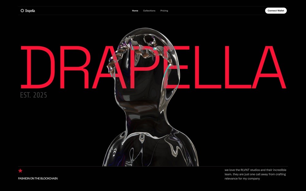
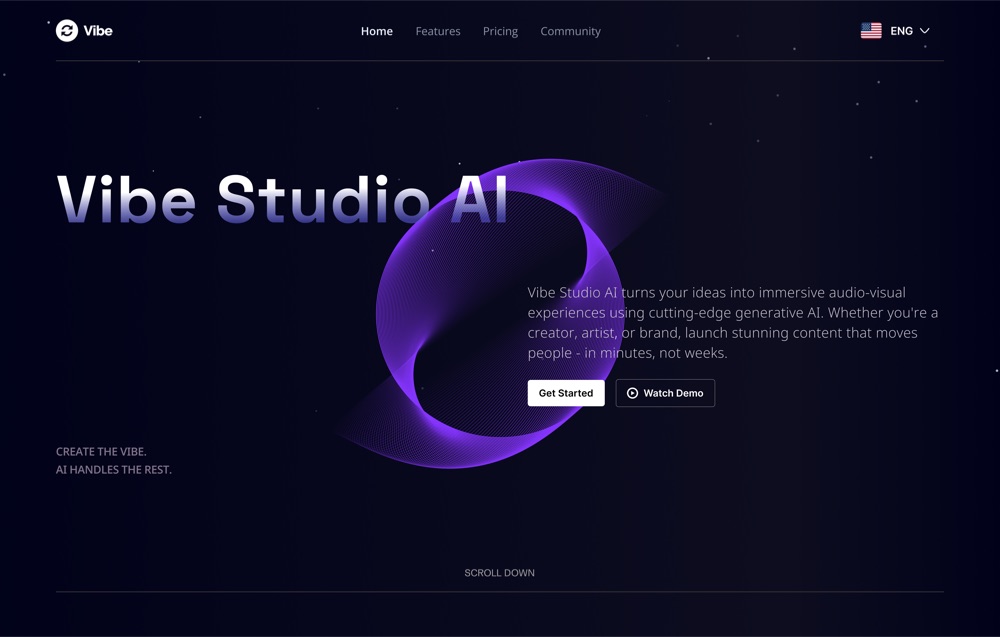
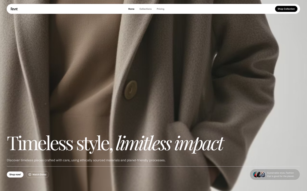
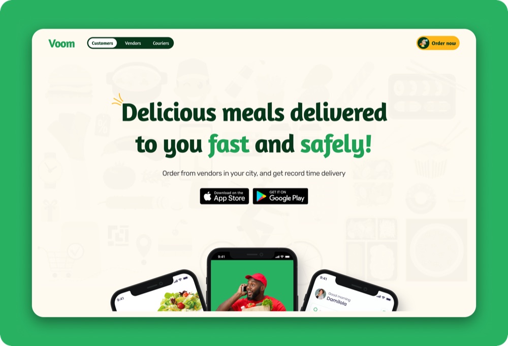
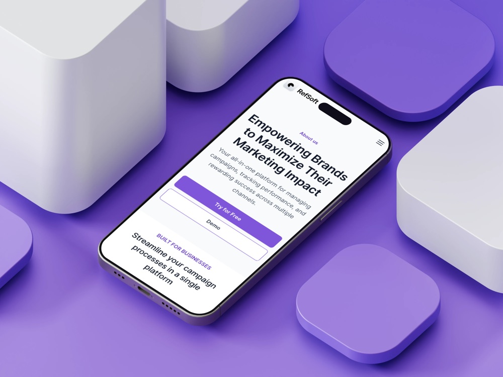
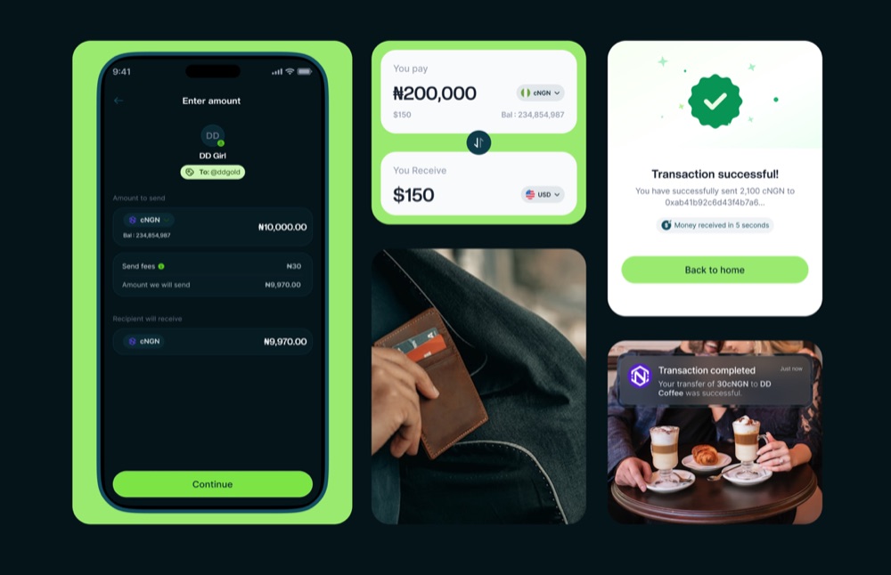
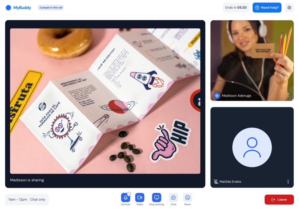
HIGHLIGHTS
[ VIEW MORE WORKS ]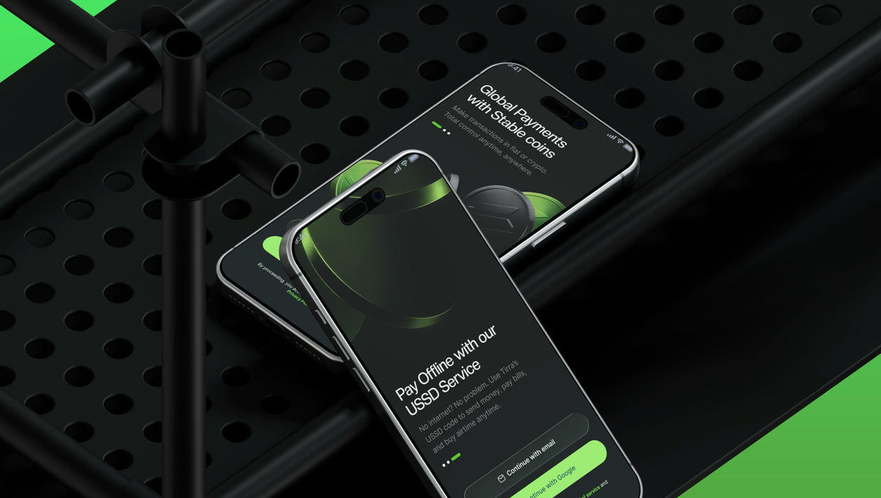 Fintech
01 / 06
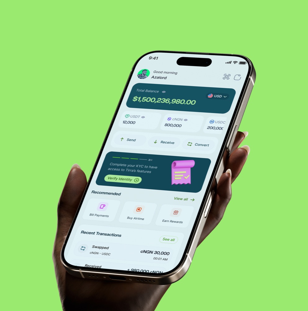
Tirra
600+ waitlist · 1k+ beta transactions
02 / 06
MSQ Design System
40% faster design-to-development handoff
03 / 06
MUST Fintech
Leading 2 Web3 products and a shared token ecosystem
 Brand & Web
04 / 06
Wowzi Brand System
One brand system across 3 products
 HR · Wellness
05 / 06
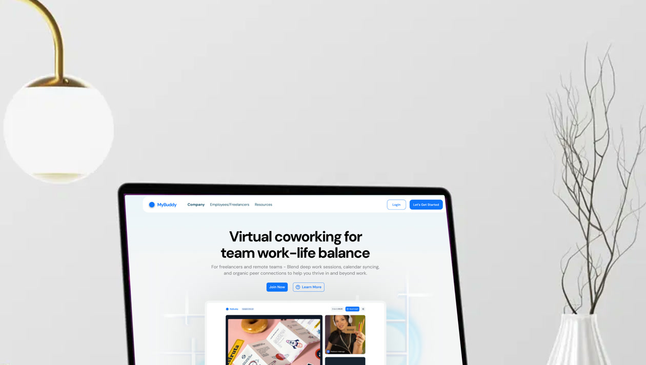
Buddily
Ethical virtual coworking across 3 user experiences
 SaaS
SaaS06 / 06
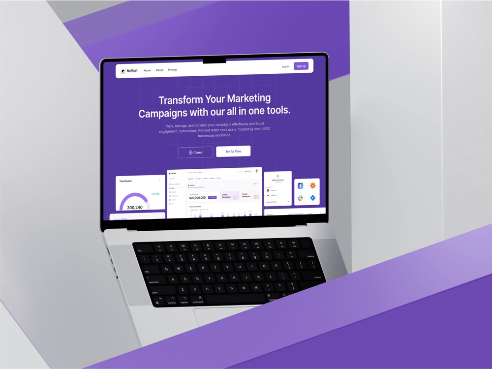
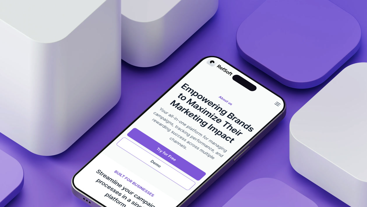
Refsoft
Marketing operations across campaigns and ROI

Hi, I'm Matilda Anashie. I design digital products, explore emerging tech, and care deeply about building things that genuinely help people.

Slice of me
'/%3e%3cg%20id='Happy'%20clip-path='url(%23clip0_0_4)'%3e%3cpath%20id='Vector'%20d='M34.1555%2033.4463C32.4515%2034.8202%2030.3286%2035.5694%2028.1398%2035.5694C25.951%2035.5694%2023.8281%2034.8202%2022.1241%2033.4463C21.6035%2033.0137%2020.9324%2032.8055%2020.2584%2032.8676C19.5844%2032.9298%2018.9626%2033.2571%2018.53%2033.7777C18.0973%2034.2982%2017.8892%2034.9694%2017.9513%2035.6434C18.0134%2036.3174%2018.3408%2036.9391%2018.8614%2037.3718C21.4648%2039.5451%2024.7485%2040.7356%2028.1398%2040.7356C31.5311%2040.7356%2034.8148%2039.5451%2037.4182%2037.3718C37.9388%2036.9391%2038.2661%2036.3174%2038.3283%2035.6434C38.3904%2034.9694%2038.1823%2034.2982%2037.7496%2033.7777C37.5354%2033.5199%2037.2725%2033.3069%2036.9759%2033.1508C36.6793%2032.9946%2036.3549%2032.8984%2036.0212%2032.8676C35.3471%2032.8055%2034.676%2033.0137%2034.1555%2033.4463ZM20.4927%2025.213C20.9969%2025.213%2021.4897%2025.0635%2021.9089%2024.7834C22.3281%2024.5033%2022.6548%2024.1052%2022.8477%2023.6394C23.0406%2023.1737%2023.0911%2022.6611%2022.9928%2022.1667C22.8944%2021.6722%2022.6516%2021.218%2022.2952%2020.8615C21.9387%2020.5051%2021.4845%2020.2623%2020.99%2020.1639C20.4956%2020.0656%2019.983%2020.1161%2019.5173%2020.309C19.0515%2020.5019%2018.6534%2020.8286%2018.3733%2021.2478C18.0932%2021.667%2017.9437%2022.1598%2017.9437%2022.664C17.9437%2023.34%2018.2123%2023.9884%2018.6903%2024.4664C19.1683%2024.9444%2019.8167%2025.213%2020.4927%2025.213ZM35.7868%2020.115C35.2827%2020.115%2034.7899%2020.2644%2034.3707%2020.5445C33.9515%2020.8246%2033.6248%2021.2227%2033.4319%2021.6885C33.2389%2022.1543%2033.1884%2022.6668%2033.2868%2023.1613C33.3852%2023.6557%2033.6279%2024.1099%2033.9844%2024.4664C34.3409%2024.8229%2034.7951%2025.0657%2035.2896%2025.164C35.784%2025.2624%2036.2965%2025.2119%2036.7623%2025.019C37.2281%2024.826%2037.6262%2024.4993%2037.9063%2024.0801C38.1864%2023.6609%2038.3359%2023.1681%2038.3359%2022.664C38.3359%2021.9879%2038.0673%2021.3396%2037.5893%2020.8615C37.1112%2020.3835%2036.4629%2020.115%2035.7868%2020.115ZM28.1398%202.27181C23.0983%202.27181%2018.17%203.76679%2013.9782%206.56769C9.78635%209.36859%206.51921%2013.3496%204.58991%2018.0073C2.66062%2022.6651%202.15583%2027.7903%203.13938%2032.7349C4.12292%2037.6795%206.55063%2042.2214%2010.1155%2045.7863C13.6804%2049.3512%2018.2223%2051.7789%2023.1669%2052.7624C28.1115%2053.746%2033.2367%2053.2412%2037.8945%2051.3119C42.5522%2049.3826%2046.5332%2046.1154%2049.3341%2041.9236C52.135%2037.7318%2053.63%2032.8035%2053.63%2027.762C53.63%2024.4146%2052.9707%2021.0999%2051.6897%2018.0073C50.4087%2014.9147%2048.5311%2012.1047%2046.1641%209.73772C43.7971%207.37074%2040.9871%205.49314%2037.8945%204.21214C34.8018%202.93114%2031.4872%202.27181%2028.1398%202.27181ZM28.1398%2048.1542C24.1066%2048.1542%2020.164%2046.9582%2016.8105%2044.7175C13.457%2042.4767%2010.8433%2039.2919%209.29989%2035.5657C7.75646%2031.8396%207.35262%2027.7394%208.13946%2023.7837C8.92629%2019.828%2010.8685%2016.1945%2013.7204%2013.3426C16.5722%2010.4907%2020.2058%208.54852%2024.1615%207.76168C28.1172%206.97485%2032.2173%207.37868%2035.9435%208.92211C39.6697%2010.4655%2042.8545%2013.0793%2045.0952%2016.4327C47.336%2019.7862%2048.5319%2023.7288%2048.5319%2027.762C48.5319%2033.1703%2046.3835%2038.3572%2042.5592%2042.1814C38.7349%2046.0057%2033.5481%2048.1542%2028.1398%2048.1542Z'%20fill='var(--fill-0,%20%23303030)'/%3e%3c/g%3e%3c/g%3e%3cdefs%3e%3cclipPath%20id='clip0_0_4'%3e%3crect%20width='52'%20height='52'%20fill='white'%20transform='translate(2.14015%201.76302)'/%3e%3c/clipPath%3e%3c/defs%3e%3c/svg%3e)
Open to product design leadership opportunities and collaborations across fintech, AI, and emerging technology.
Let’s Talk.
Selected work
Hiring or building? Let’s talk
 Web Design
01 / 09
Folde Studio
A scalable sales and publishing system
Fintech02 / 09
Tirra
600+ waitlist · 1k+ beta transactions
03 / 09
Wowzi
Creator marketplace across user types
04 / 09
MUST Fintech
Leading 2 Web3 products and a shared token ecosystem
05 / 09
MSQ Design System
40% faster design-to-development handoff
Brand & Web06 / 09
Wowzi Brand System
One brand system across 3 products
HR · Wellness07 / 09
Buddily
Ethical virtual coworking across 3 user experiences
SaaS08 / 09
Refsoft
Marketing operations across campaigns and ROI
 E-commerce
09 / 09
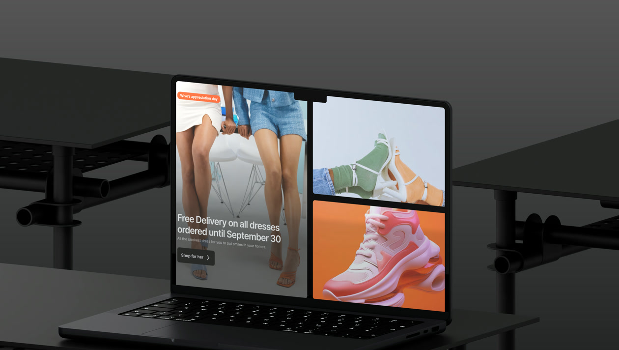
TAJRR
Two-sided commerce across web and mobile
Open to product design leadership opportunities and collaborations across fintech, AI, and emerging technology.
Let’s Talk.

Hi, I'm Matilda Ipeh Anashie
I'm a Nigerian Product Design Lead with 6+ years of experience designing AI, fintech, creator economy, SaaS, and Web3 products across Africa, Asia, and Europe.
My background in Electrical and Electronics Engineering and Telecommunications Engineering shapes how I work: understanding complex systems, finding the human problem within them, and building clear, trustworthy products. I currently lead product design for MUST Company’s Blockchain and User Experience Innovation Design team, guiding a four-designer team across two Web3 products, their websites, and a shared token ecosystem. I also introduced design-system and AI-assisted workflows that improved design-to-development handoff by 40%.
Beyond product work, I co-founded Canann Impact Foundation, contribute to open-source technology through Outreachy and ODK-X, and support the design community through mentorship, writing, and speaking.
My essays, notes, experiments, and opinions.
- read a new chapter

 fill journal pages
- disappear into a playlist

 draw or just doodle
- notice type everywhere

something happened today and I realised —
"Everything we need to be happy in life is right in front of us and yet we look for it in all the wrong places."
Living life in colours 🌻🦋

I love watching movies, but my latest obsession is K-drama. The stories and the acting keep me absolutely glued to my screen. A perfect weekend unwinding mood.
Open to product design leadership opportunities and collaborations across fintech, AI, and emerging technology.
Let’s Talk.

Bits of my life
One brand. Three products. Built for Africa’s creator economy.
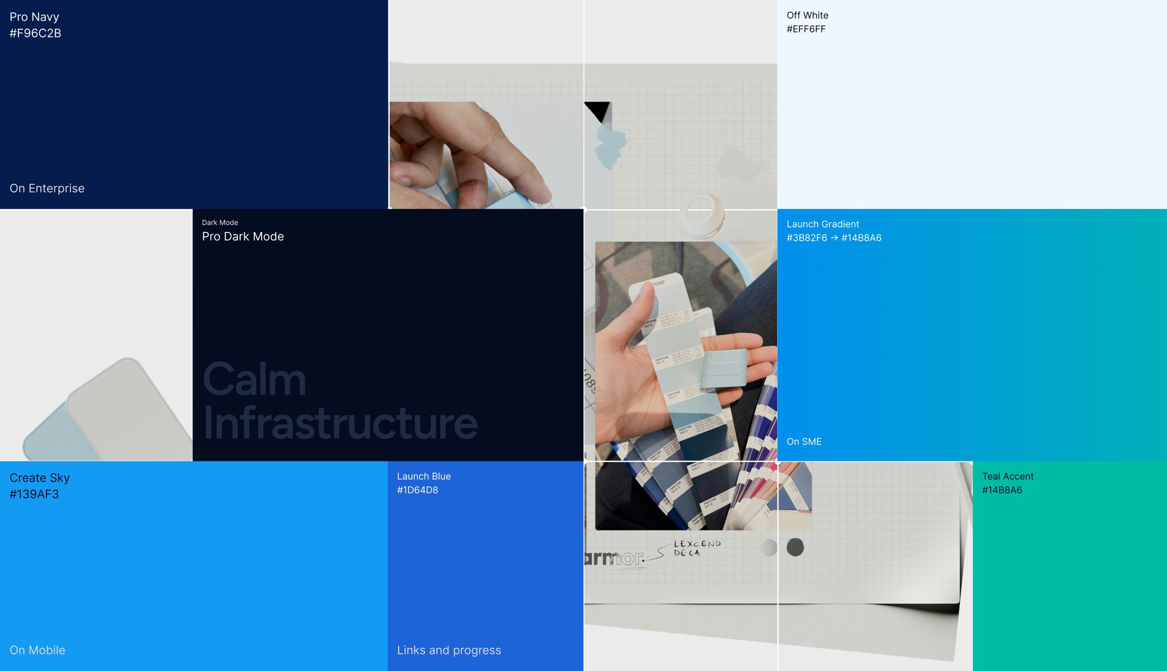
One brand. Three very different people to talk to.
Wowzi needed one credible parent brand without flattening the differences between its enterprise, SME and creator products. The work had to establish shared standards while giving each audience a recognisable experience.
The system needed to feel structured and dependable for enterprise buyers, fast and approachable for SMEs launching campaigns, and warm and mobile-native for creators managing work and payouts. Same company, three different relationships.
Created one brand system across Wowzi Pro, Launch and Create, translating three audience needs into shared guidelines, product rules and a redesigned marketing website.
The challenge was not making three products look identical. It was making each one feel appropriate for its audience while remaining unmistakably Wowzi.
Starting from a north star, not a logo.
I defined the three products as related personalities, each with its own shape, tone and interaction character while the parent Wowzi layer carried the shared trust signal. The structure acknowledged that the audiences were different without making the products feel unrelated.
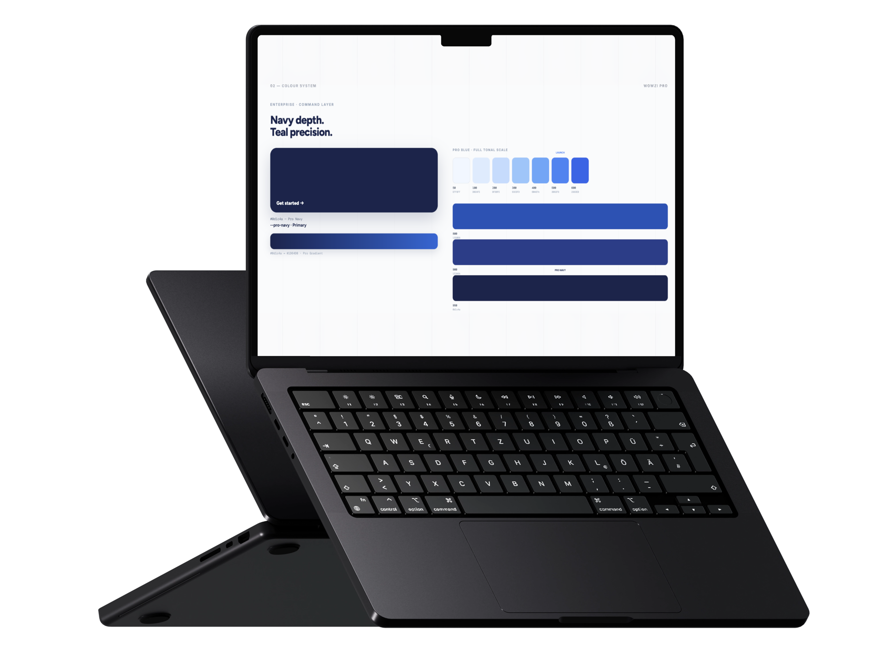
CMOs and agency leads. Sharp corners, navy and blue, formal copy that leads with numbers. “181,000 creators. One campaign. 24 hours.”
SME owners and brand managers who just want their campaign live. Friendlier, rounder, a blue–teal gradient. “Your campaign, live in 48 hours.”
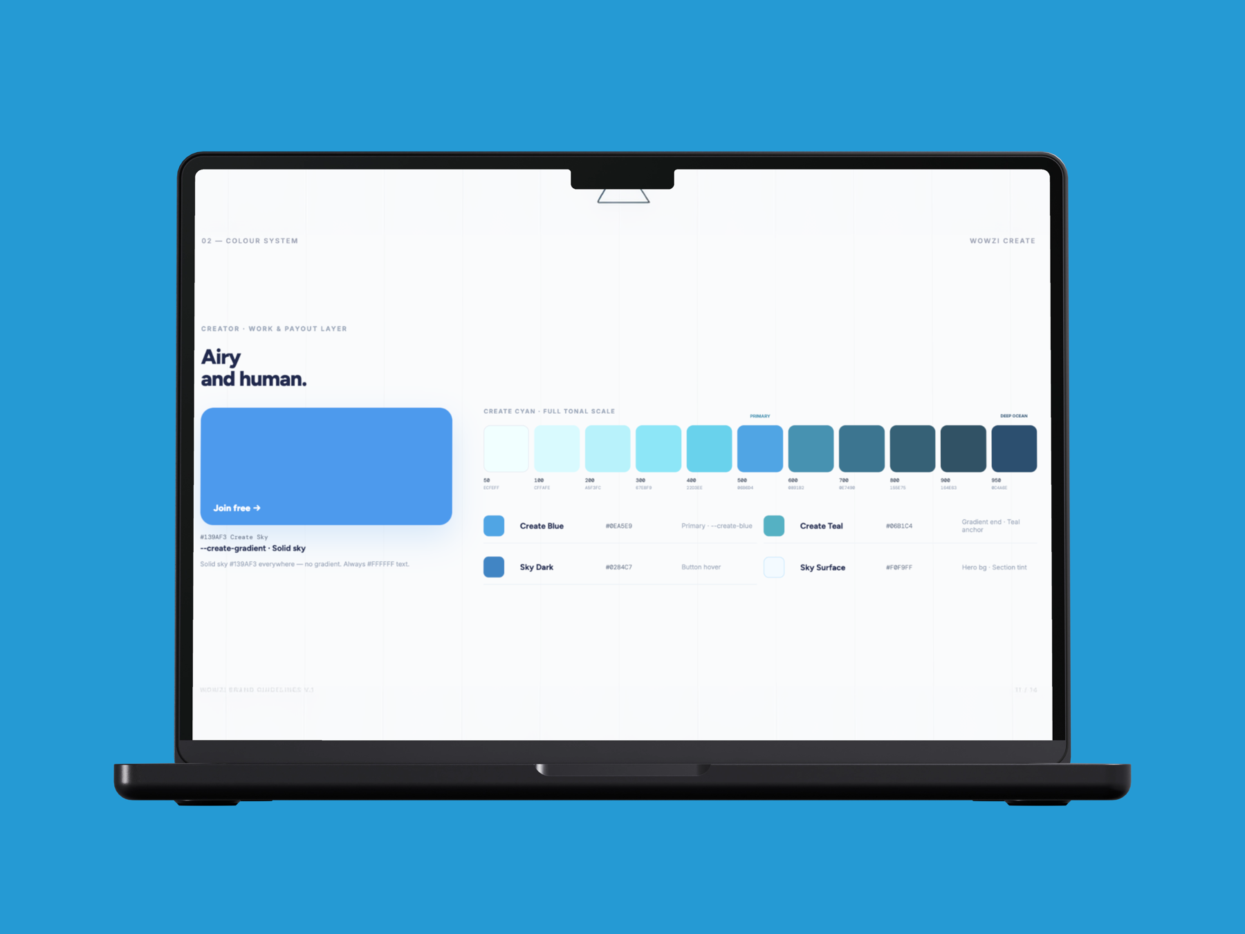
Nano and micro earners, mostly on mobile. Pill-shaped everything, sky and teal. “Your hustle. Your income. Your way.”
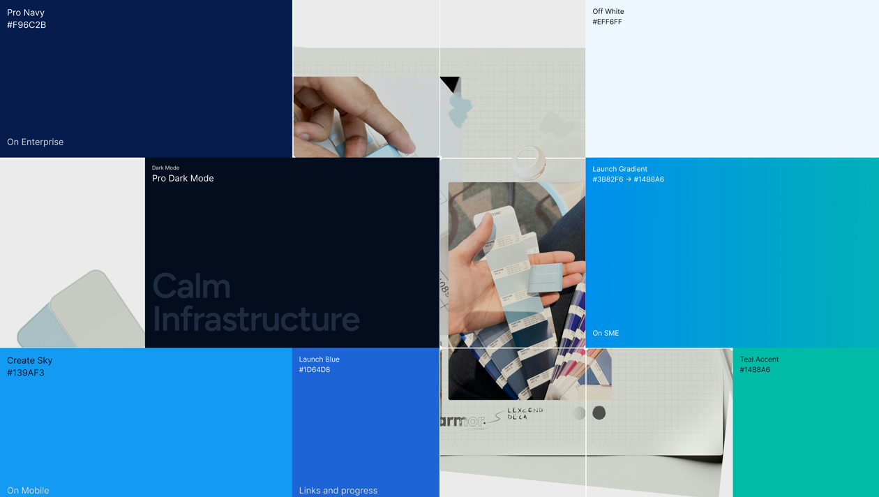
A palette that stays in one family.
Instead of assigning each product a totally separate colour — which is how multi-product brands end up looking like three unrelated startups wearing the same name tag — everything pulls from one cool, navy-to-teal family. Pro gets the deepest, most institutional end. Launch sits in the energetic middle with a gradient. Create lives in the lighter, airier sky end. Same family, different outfits.
There’s also a real effort to make the colour system defensible, not just pretty. In dark mode, the teal stays exactly the same across all three products, and only the secondary accent shifts. That’s the kind of consistency that actually survives contact with a real engineering team.
Typography and voice that match the audience, not just the brand.
Figtree carries the big, confident headline moments. Inter handles UI and body text. DM Mono shows up specifically around numbers, metrics, and hex codes — giving the system a quiet “we deal in real data” texture whenever it counts something.
The voice work goes further than most brand decks bother to. Five traits — clear, calm, confident, precise, human — are defined once for the whole brand, and then each product gets its own dial setting on those same traits. Same five ingredients, different ratios.
Figtree’s rounded geometry is warm and modern without being playful. Inter is the gold standard for UI legibility at every scale. DM Mono gives data a quiet precision texture.

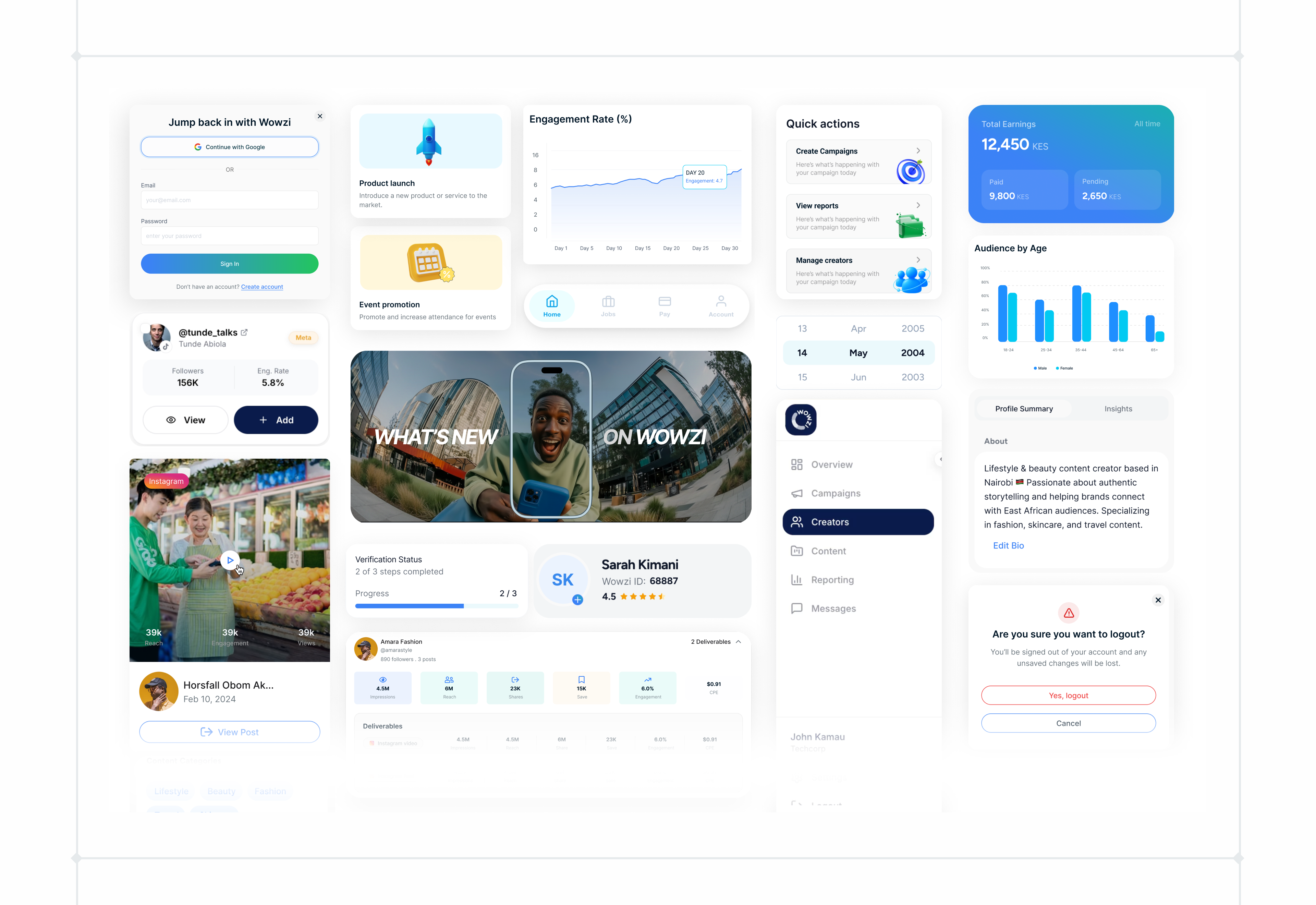
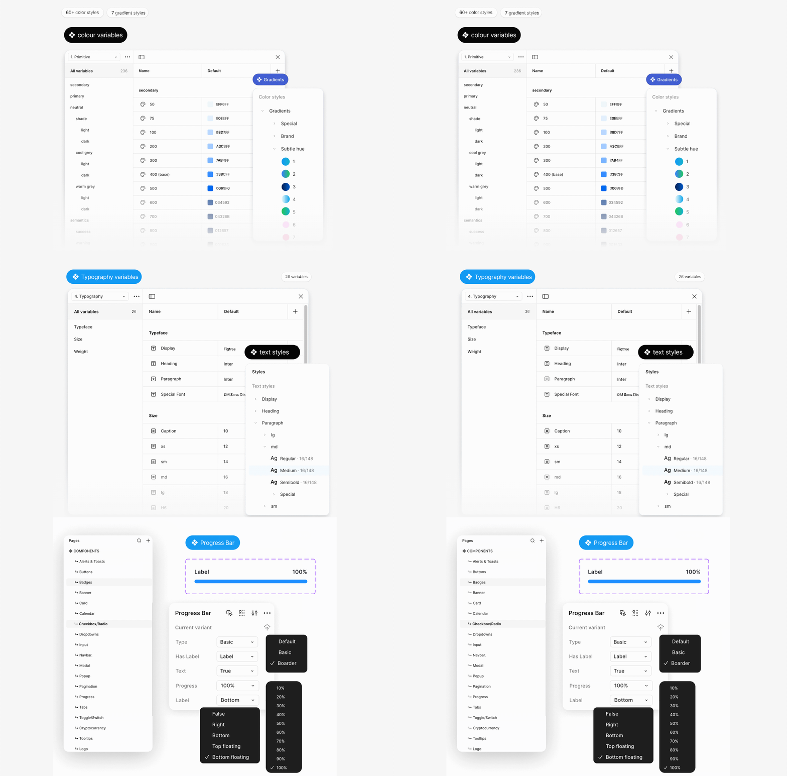
Where the brand deck ends, the design system begins.
The brand guidelines explain why things look the way they do. The design system is where that turns into something a designer or engineer can pick up and build with directly — tokens, components, and rules with no wiggle room.
Lucide only, 2px stroke, never filled, sizes restricted to 4px multiples. Brand colour reserved for active states only — prevents every icon on a page from competing for attention at once.
Pro has zero bounce — an enterprise dashboard that springs feels untrustworthy. Launch gets a gentle spring. Create gets a visible playful bounce, explicitly fenced off from the other two products so it can’t quietly creep in over time.
Reduced-motion fallbacks are mapped out animation by animation. State changes — like a successful payment — can never be communicated through motion alone. It has to also show up in colour and text.
The system and website design were completed. The website was not launched.
I delivered the visual identity, Brand Guidelines V.1, shared product design system and redesigned marketing website during the two-month engagement. I left Wowzi before the website moved into production, so this case does not claim post-launch conversion or lead-generation results.
The most important decision was separating consistency from sameness. Shared foundations created recognition and maintainability; product-level differences in tone, shape and motion preserved relevance for each audience.
Because the website did not launch before I left, the strongest evidence from this engagement is the completed system itself: a documented brand architecture that gives future designers, marketers and product teams a clearer basis for making decisions across all three products.